Mostrar mensagens com a etiqueta 15843. Mostrar todas as mensagens

sexta-feira, 29 de novembro de 2024

Can you rebrand a republic?

XXIII Portuguese Government Visual Identity System, Studio Eduardo Aires, 2023


Over the past weekend, I attended a lecture by designer Eduardo AiresThe conference evolved around typography and Aires discussed a recent rebranding done by his studio for of the Republic of Portugal.

The Government's visual identity was changed by António Costa's Executive in the first half of 2023. The objective, as explained in the brand manual, was to adapt the image to the digital environment, in which much of the communication takes place. The lecture provided a detailed description of the strategic and aesthetic choices made, keeping a clear focus on aligning with the spirit of the current era, emphasizing readability, legibility, and suitability for digital platforms.


XXIII Portuguese Government Visual Identity System, Studio Eduardo Aires, 2023


One of the significant elements featured in the new branding is a costume-made typeface, made in collaboration with Dino dos Santos (which attended the lecture as well). The design of the typeface for the Government of the Portuguese Republic involved a careful balance between tradition and contemporaneity, legibility and visual distinction. The resulting font, with its wide range of glyphs and attention to linguistic detail, is capable of representing the image of the Portuguese Republic in different contexts and in over 250 languages, offering a consistent and distinctive tool for Portugal’s communication in the world.


I felt that, although the outcome might be perceived as somewhat simplistic, the process was profound and thorough, with an emphasis on forward movement and modernization, both spiritual and practical. I found a great amount of grace in the way the complexed flag was abstracted in an elegant and playful manner, and I was pleased to discover that the Portuguese Republic had initiated and collaborated on such an endeavor.

As the lecture was over I was keen to know where, and as I ran I quick google search I was surprised to discover that the fresh new branding that just presented has already been shelved, after being at the center of a widely discussed public debate. Apparently the logo had reverted to the old former version. This not only reintroduced the detailed flag, but also added a three-dimensional depth that made the logo unit even more complex than the flag itself.

2023 / 2024

And here we have a worthy subject for discussion – isn't it fascinating how "good" is a subjective state of mind? How many process aimed to make a significant progress moves in a circular way (back and forth) and not necessarily "up" or "forward"? I never imagined that anyone might oppose a progress, especially such an aesthetically reasoned one. I had to dig a bit deeper.


The 24th government came into power on April 2, 2024. An article published on April 4, 2024, describes the following:

Official Government website restores previous logo

The logo change took place immediately after the inauguration of the Prime Minister and the new Government. It was a commitment that the Prime Minister made before the campaign. "Enough of plastic politics", said Luís Montenegro at the time.

Apparently, Luís Montenegro, as leader of the Social Democratic Party (PSD), was highly critical of this new logo prior to being elected. His main criticism was that the logo did not adequately reflect Portugal's history and tradition, particularly regarding the coat of arms and other national symbols. He argued that the government was trying to "rebrand" the nation in a way that downplayed important elements of Portugal's heritage and identity.

Some specific points raised by Montenegro and his party included:

  1. "Aesthetic and historical dissonance": He believed that the new logo, by simplifying and altering traditional elements, created a disconnection from Portugal's established symbols and values.
  2. Absence of key symbols: He pointed out that the official coat of arms (the "five shields" of Portugal) was reworked and was no longer displayed in a form that closely adhered to its historical design, which was an important national symbol.
  3. Political motives: Montenegro and others in his party suspected that the new logo was part of an effort by the Socialist government to create a more "modern" image of the Republic, potentially for political reasons rather than for the sake of national unity and tradition.


While the former government, led by António Costa and the Socialist Party, defended the design as a step toward modernization, this issue became part of a broader political debate about the balance between tradition and modernization in national symbols. Montenegro and the PSD viewed the government's push for the new logo as an example of left-wing political maneuvering, while the government argued that the new design was not about undermining tradition, but rather about making Portugal's identity more approachable and relevant in the modern era.


An article published on April 3, 2024, describes the following:

"The new logo of the Portuguese Republic, launched last year, has been shelved by Luís Montenegro. The decision has been praised by brand and communication experts."


I'll finish with a mesmerizing quote by Carlos Coelho, an outspoken critic of the rebranding (retrieved from the article mentioned above):

“Going back is always better than continuing down the wrong path"


Is it, though? 


sexta-feira, 15 de novembro de 2024

Bruce Nauman's unsettling words

Bruce Nauman is a renowned contemporary artist whose work spans a wide range of media, including sculpture, performance, video, neon, and installation. One of the most intriguing aspects of Nauman's practice is his exploration of language, particularly how words and typography function as both formal elements and conceptual tools. His works often manipulate language to probe the limits of communication, the instability of meaning, and the relationship between language and perception. Typography in Nauman’s work serves as more than just a graphic design element; it becomes a medium for unsettling viewers, challenging them to reconsider how words are experienced and interpreted in the visual realm.


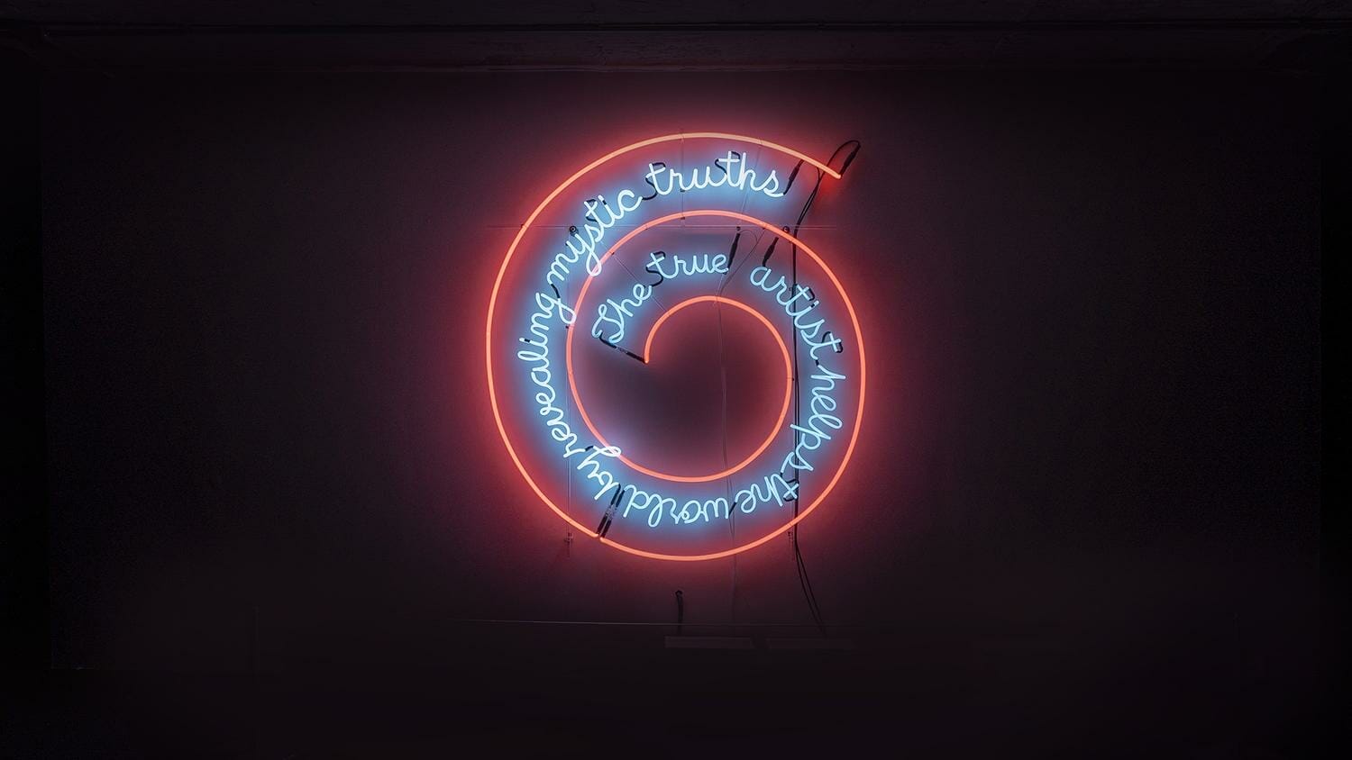
The True Artist Helps the World by Revealing Nature of Human Existence, 1967


In Nauman's neon works, such as The True Artist Helps the World by Revealing Nature of Human Existence (1967), the artist uses bold, direct text to confront the viewer with philosophical and existential inquiries. These neon signs transform the space they occupy, turning the words into physical objects that demand attention. The use of typography in these works is not just for legibility, but also for its ability to create an immersive experience. The glowing, often fragmented letters are rendered in a stark, mechanical font that emphasizes their materiality while also invoking a sense of alienation. By using neon, Nauman amplifies the tension between the ephemeral nature of light and the permanence associated with written language, forcing the viewer to confront the weight of the words themselves.


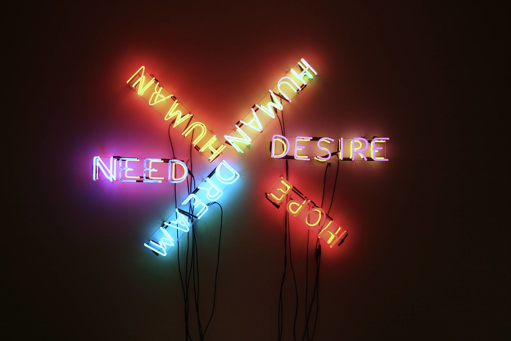
Human/Need/Desire, 1983


Human/Need/Desire (1983) is a striking neon installation that explores the fundamental aspects of human existence—our needs, desires, and the intrinsic nature of being. The work consists of a series of neon signs, each flashing one of the three words—“Human,” “Need,” and “Desire”—intermittently in bright, vivid colors. The pulsating lights draw attention to the tension between these basic human conditions, creating an intense, almost overwhelming experience for the viewer. The repetition of the words, combined with the raw, cold aesthetic of the neon medium, emphasizes the urgency and cyclical nature of these concepts, while also evoking a sense of isolation and introspection. Nauman’s use of neon, a medium often associated with advertising or commercial signs, here becomes an unsettling vehicle for philosophical inquiry, forcing the viewer to confront the emotional and existential weight of the words themselves. In this work, Nauman interrogates how language, light, and space can reflect the complexities of the human psyche and the paradoxes inherent in human life.


100 Live and Die, 1984


The conceptual weight of Nauman's work with words and typography can also be seen in his repeated explorations of wordplay and paradox. In pieces like One Hundred Live and Die (1984), Nauman uses language to evoke the cyclical and sometimes contradictory nature of existence. The repetition of simple yet profound phrases such as "Live and Die" reflects the constant loop of human experience, while the use of text as a rhythmic, almost meditative element emphasizes the tension between the fleeting and the permanent. Typography, in these cases, takes on an additional layer of meaning, where the visual representation of the words, their placement, and the rhythm of their repetition become part of the philosophical inquiry. Through these works, Nauman not only challenges the viewer’s understanding of language but also invites them to experience the material and conceptual weight that words carry in the context of art.


segunda-feira, 4 de novembro de 2024

Visual Poetry by Nitzan Mintz

Nitzan Mintz is a visual poet from Tel-Aviv based in New York. She began working over a decade ago in the streets of Tel Aviv, where she would create visual poetry for specific locations in the city. 

In her early works, the main objective was rather poetic than artistic. The urban environment allowed a far greater exposure than any niche gallery or esoteric poetry magazine. The medium  graffiti, street art — served merely as a means, aimed at increasing the reach of the poem and exposing it to a broader audience.


Anchor Acrylic on metal, Tel Aviv, Israel, 2016 (English translation here)


The first poems, were long and obtained somewhat of a verbal complexity. Consequently, the primary goal of the craft-making was, first and foremost, readability and legibility— the ability to delve deeply into the words, what is referred to as "content is king." 

"The textual imagery is created with stencils that function as actors. They have a dreary outline that is purposely sourced from municipal signs and obituary notices. The shapes of the letters are decontextualized. Introduced in a new composition, they become an element in the final image."


Common Hebrew stencil


Over time, Nitzan expanded her range of artistic expression and began to "play" with various typographic tools at her disposal, experimenting with different fonts (at times, she even "sculpts" her own geometric lettering) and reducing the leading to the point of compromising the text's readability. This approach, of challenging the viewer's reading ability, adds a new layer of enigma to the text. Whereas before it was immediately recognizable as a "poem" or "words," the elimination of spacing transforms the text into a kind of tangled spider web/.


The Eye is Closed Acrylic on metal, Tel Aviv, Israel, 2019

The eye is closed from the outside and inside" ".No one in the house


Some Wounds Have a Stairwell Inside Wall painting, Dead Sea, Israel, 2019

As her International career took off, the demand for works in diverse languages grew, mostly in English. As a result, Nitzan began translating her works, sometimes creating a site-specific piece in the original language, while enlisting translators as needed.


My Disappearance Wall painting, Munich, Germany, 2017


Within time the experimenting extended beyond the layout and Nitzan has expanded her technique to various materials and surfaces, other than the classic wall-stencils. Her poems are later developed into her visual pieces, where she mainly uses leftovers from the public sphere, industrial materials and paint.


The Heart Pushes Roofs to the Sun Wood and wall paper installation, Tel Aviv, 2020


She later continued to create studio pieces, existing alongside the outdoors murals in an ongoing symbiosis. The emphasis in these works was on creating multi-layered pieces, with bold materiality and tactility, while the content component gradually fades, to the point of being barely-readable. The abstract text is accompanied by additional abstract elements, which together create an enigmatic piece that demands deciphering. These pieces allow a deeper look inwards, into the vague and raw place where the words are undermined.


The Heart mixed media, 200x40 cm, 2023


The Eye Mixed media on paper, 2022, 79x65 cm


These are, later to be described as "collages of words and materials":

"The majority of the pieces are made of leftovers: pieces of wood, metal plates, different types of paper, construction remains, all of them no longer serve their original purpose. All of them carry stories from their past. Through these stories and what I might add to them, I can reveal something personal of my own."